New and Historic: Fostering Urban Communities
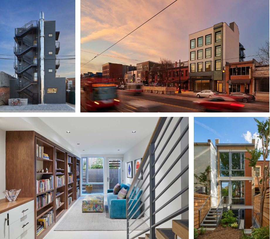
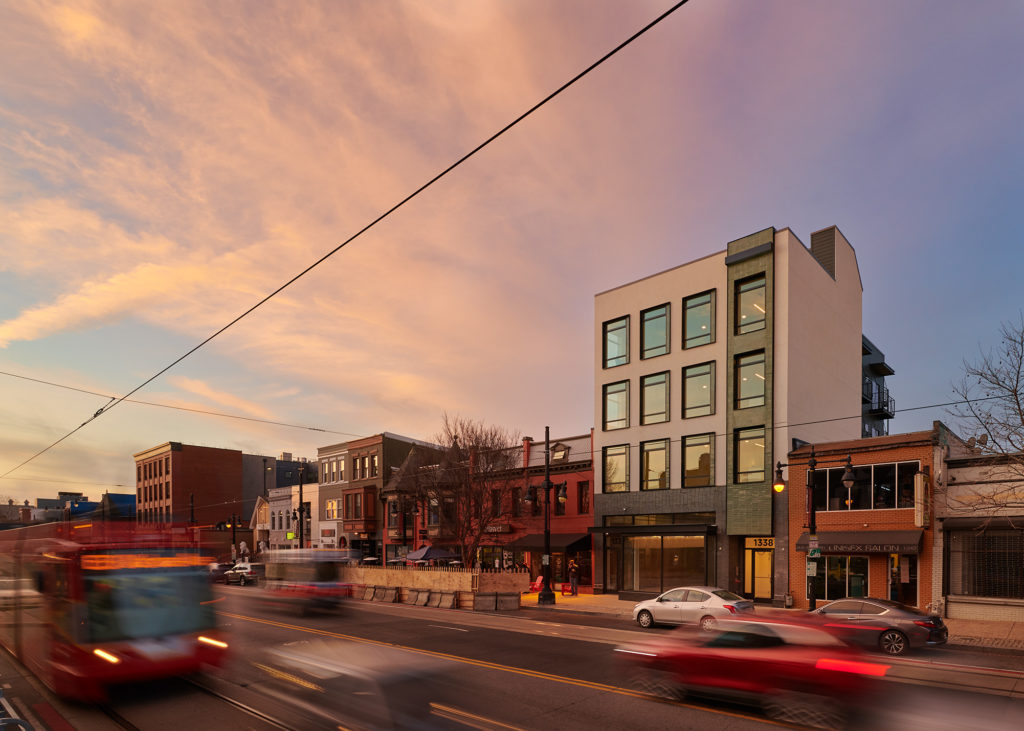
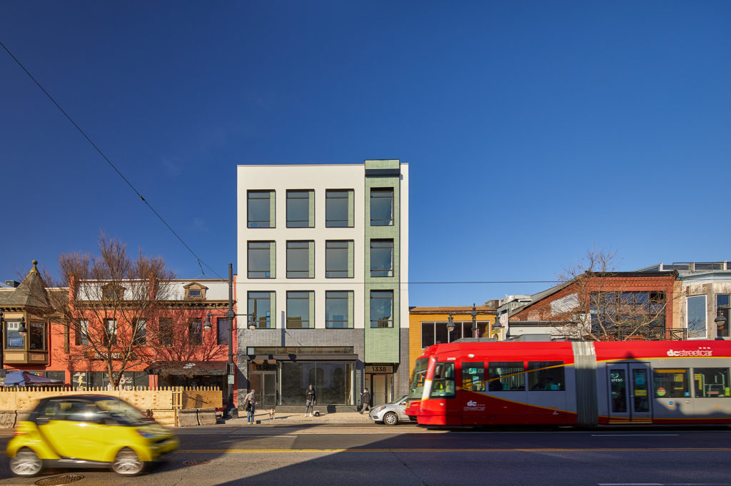
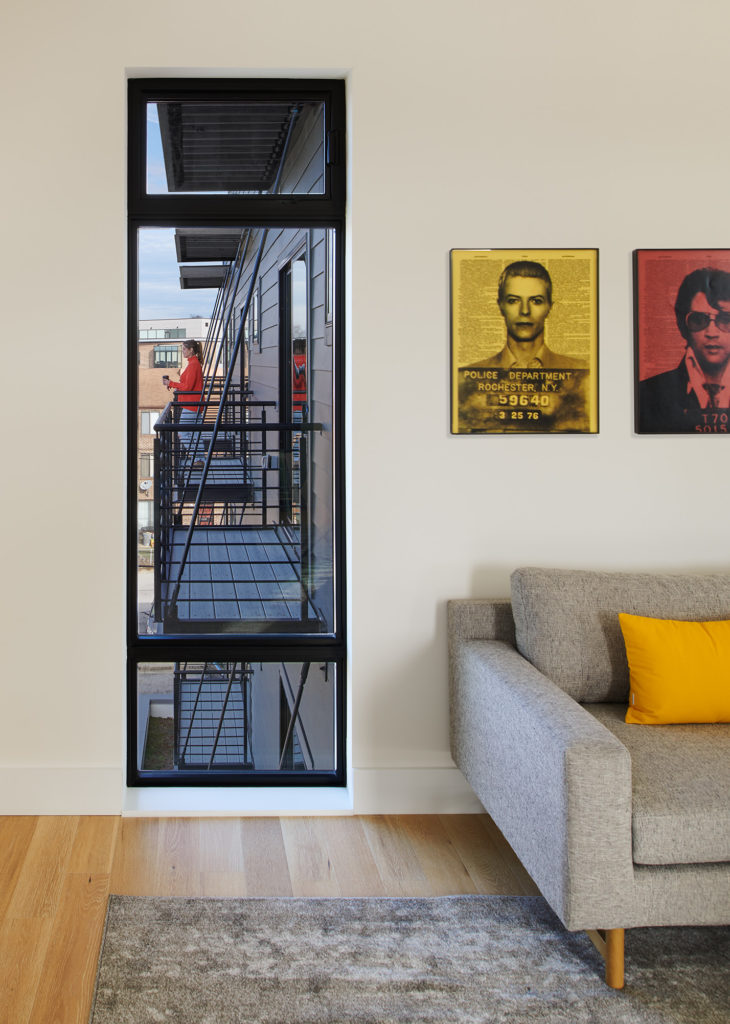
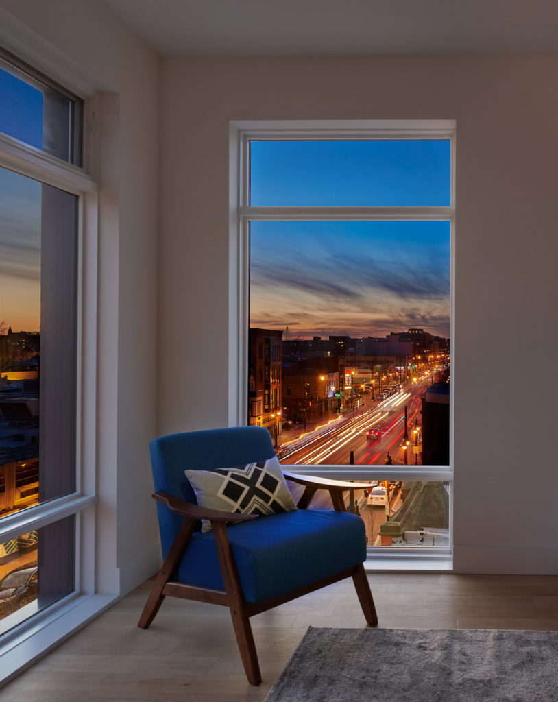
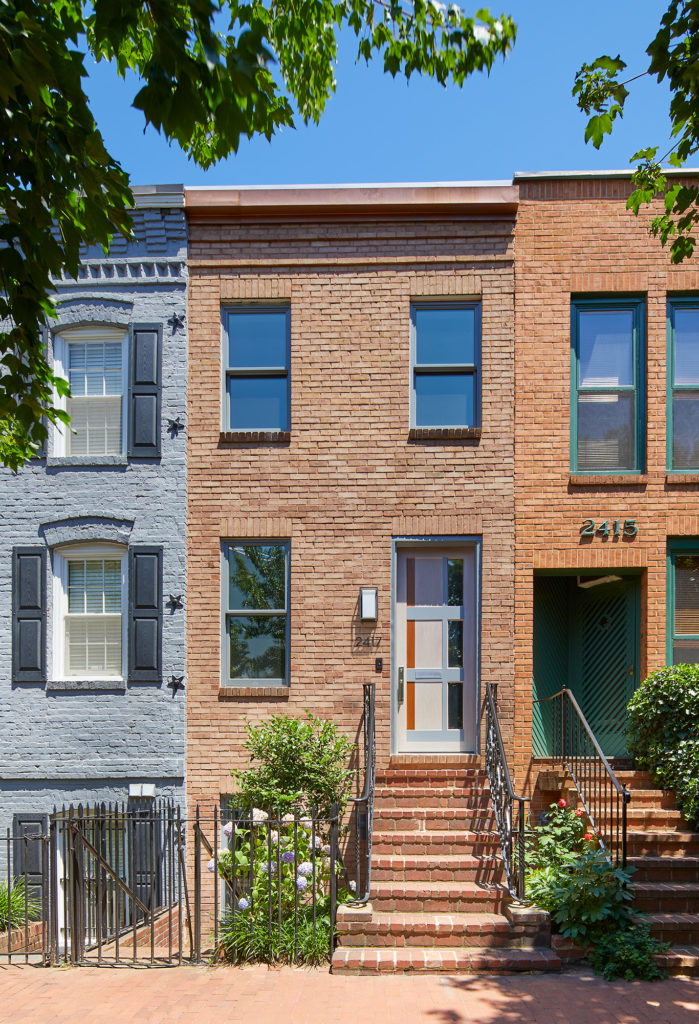
Bonstra | Haresign ARCHITECTS recently completed two residential projects across the city that uniquely enhance the urban fabric and reinforce a connection between their residents and the community. A new infill project along the lively H Street corridor reflects the neighborhood’s energy and diversity, with a contrast of materials and forms in a contemporary composition that relates to the proportions of its re-purposed Victorian neighbors. A Foggy Bottom rowhouse built in the late 1880’s is preserved and revitalized for a client legacy with a contemporary style and creative design solutions to allow sunlight to penetrate into a narrow building envelope.
THE ALDEA
H Street Corridor, Washington, DC
Residential / Co-housing
Commercial Retail
Completed: December 2020
Size: 11,000 SF
Units: 3 units (5-BR 5-BA each)
Client: Coba Development
Contractor: Harbor Builders
Photography: Anice Hoachlander
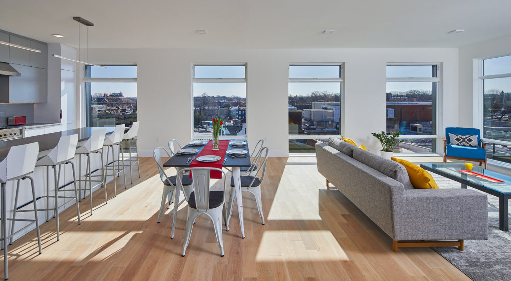
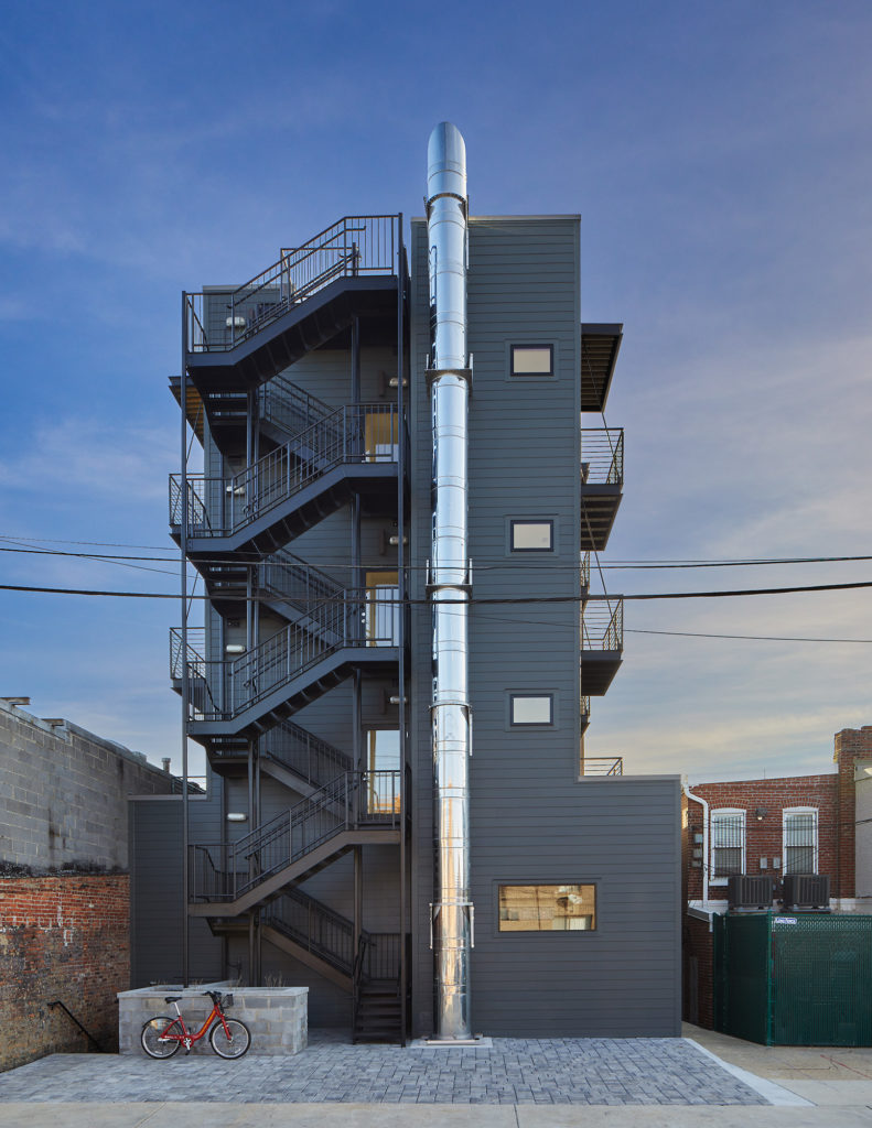
The Aldea is a mixed-use residential project located at 1336 H Street, NE on one of the oldest commercial thoroughfares in Washington DC. It is in one of the city’s most historically vibrant and rapidly changing neighborhoods, and the only one served by a streetcar today. This area was one of the 3 hardest-hit corridors, suffering catastrophic damage during the 1968 riots in the aftermath of the assassination of Dr. Martin Luther King, Jr. The building features street-level and below-grade retail, and large, co-living residential apartments above, crowned by a rooftop deck with panoramic urban views.
2417 Eye Street, NW
Foggy Bottom, Washington, DC
Single Family
Historic Preservation / Renovation
Completed: September 2020
Size: 1,700 SF
Client: Withheld
Contractor: ThinkMakeBuild
Photography: Anice Hoachlander
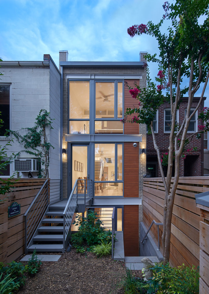
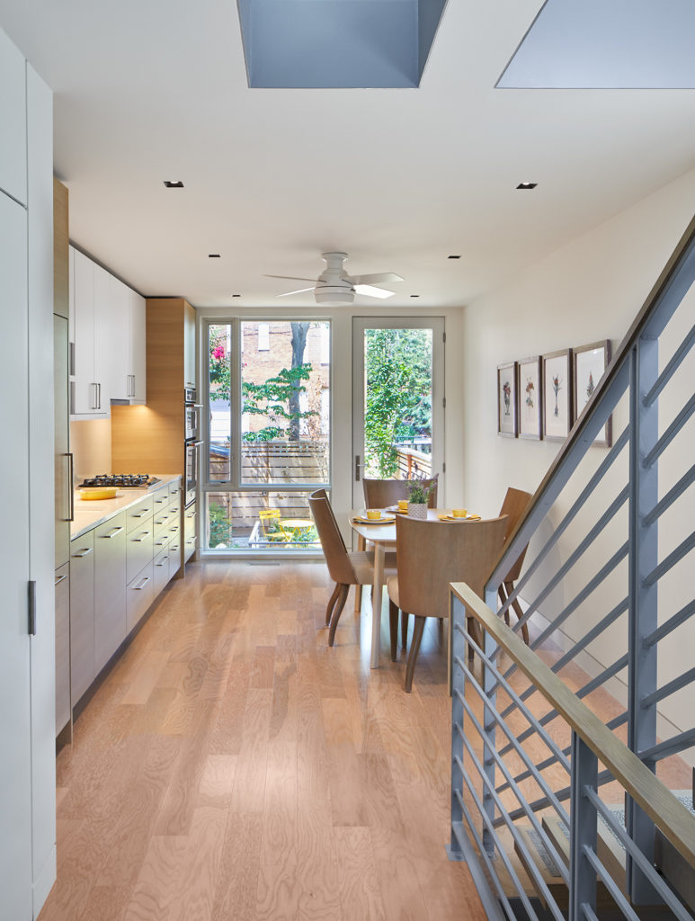
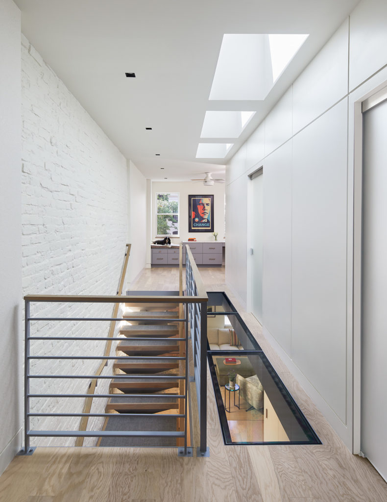
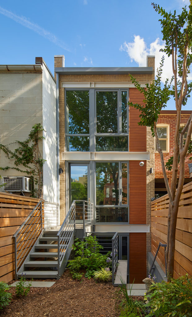
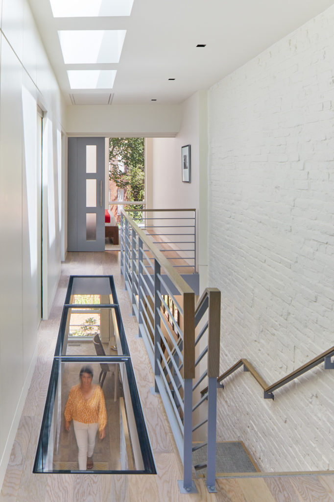
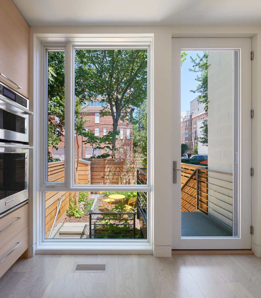
This late 1880s rowhouse shares party walls with other simple brick structures in Washington, D.C.’s historic Foggy Bottom. Creating open floor plans and light-filled spaces in a 125-year-old brick structure less than 12 feet wide allowed the design team a chance to innovate with spatial expansion, lighting solutions, and architectural details. Given the building’s long, narrow footprint, the team studied several options for a workable floor plan reflecting the client’s desired contemporary style. The new dumbbell-shaped layout maximizes the full width and takes advantage of both exterior walls to strengthen indoor-outdoor connections.

