Clear View in Foggy Bottom
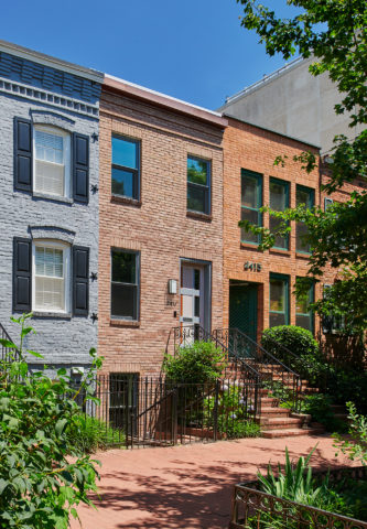
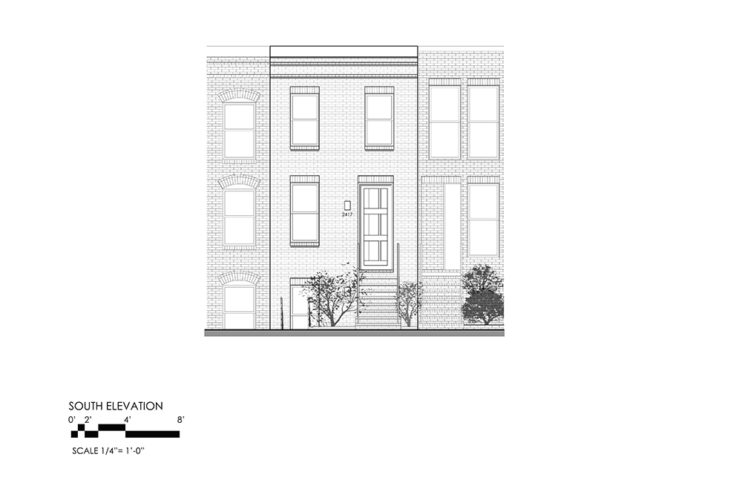
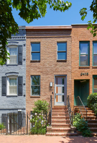
Exterior South façade and street view of the rowhouse on I Street. Although the Historic Preservation Board provided limited avenues for design changes to the façade, the replacement of existing windows, exterior lighting, and the design of the front door were thoughtfully planned to foretell the design on the interior and at the rear facade.
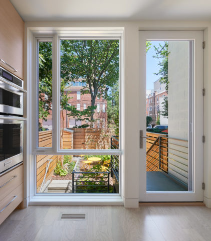
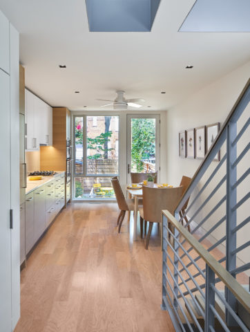
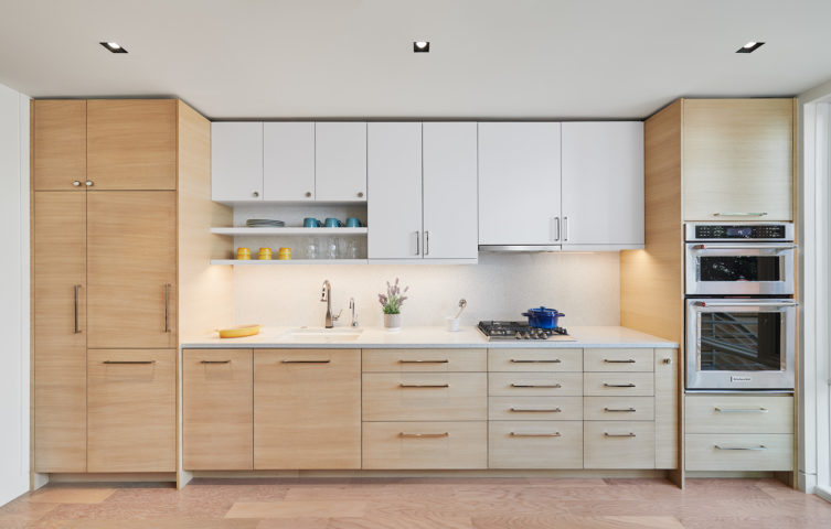
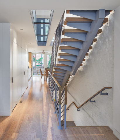
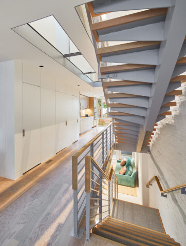
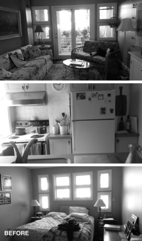
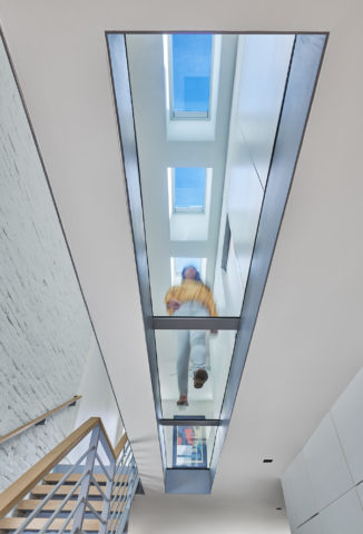
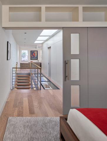
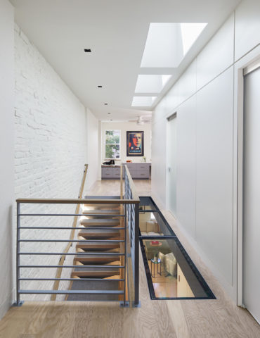
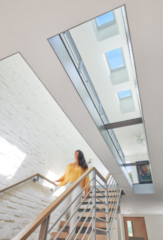
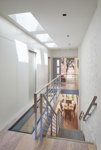
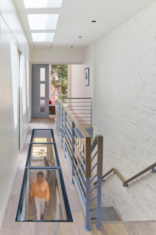
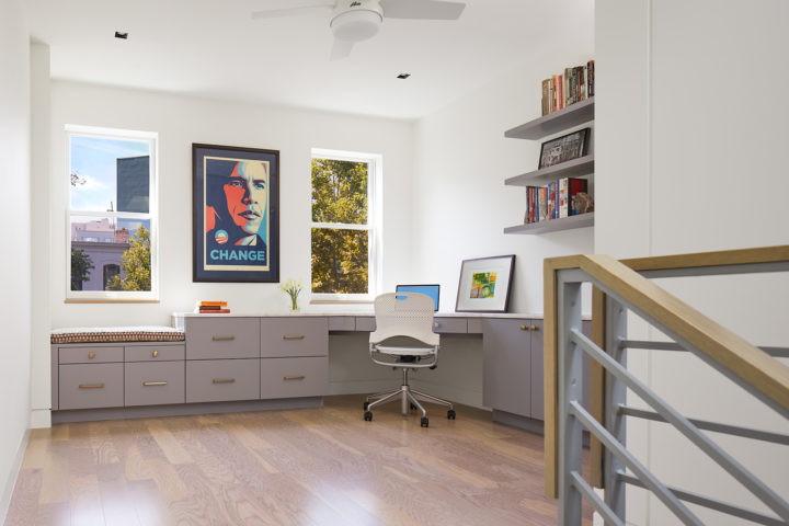
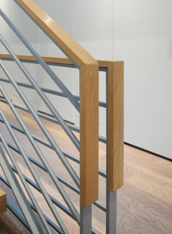
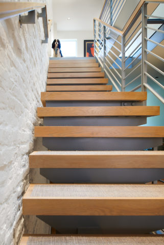
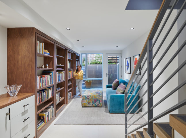
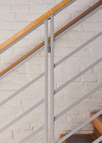
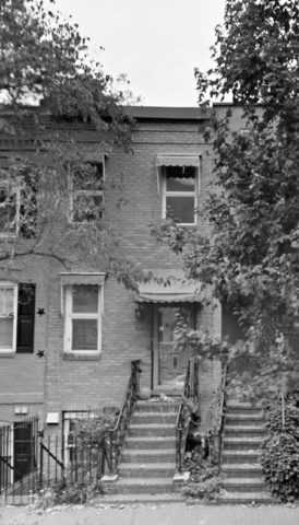
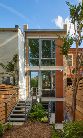
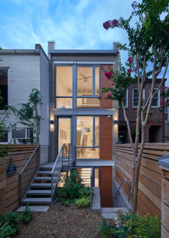
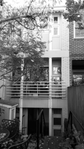
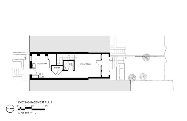
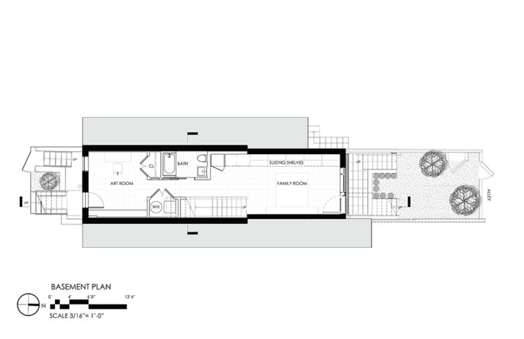
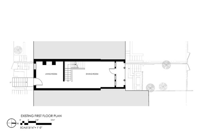
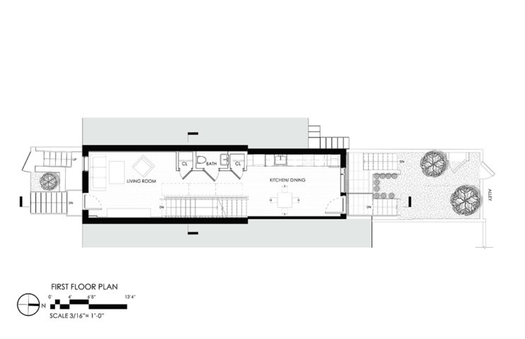
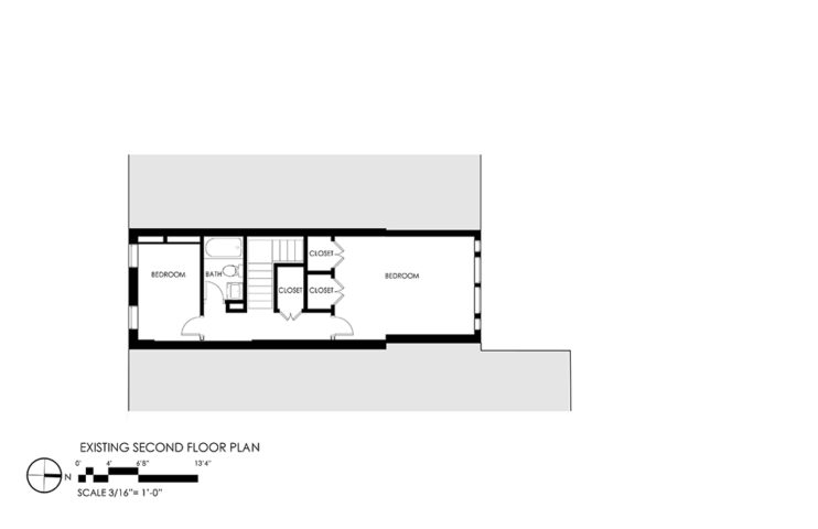
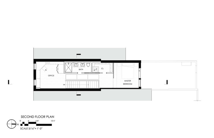
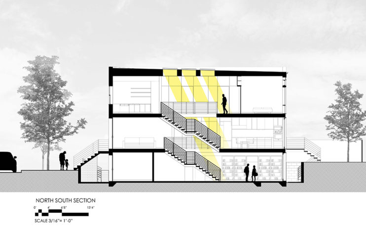
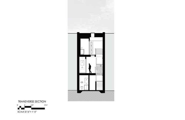
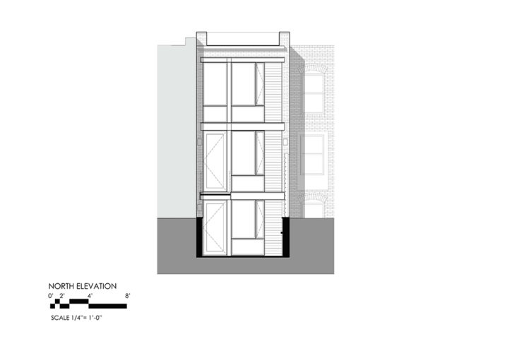
Rear view of the kitchen, facing the rear yard. View of the kitchen, facing North View of the Kitchen at the North end of the house. The objective of the kitchen area, along with the rest of the house, was to also maximize space as much as possible. Therefore, a linear kitchen design was achieved with aligning cabinet doors and open shelving, while the finishes contributed to its lightweight appearance. Interior, ground floor view of the Focus and ceremonial stair. The stair was intended to be a statement in the Focus and was uniquely designed with an offset, monostringer, as well as painted to echo with the exterior and interior finishes. Perspective View of the Stairs and Basement Living space, kitchen, and bedroom BEFORE Upward view of the glass floor Interior view of the second floor bedroom, facing hallway. The boundary between the hallway and bedroom was delineated by a moving element, the barn door, with frosted glass panels for light infiltration and privacy. The limiting width of the existing house also sparked new ideas to gain additional storage. Interior, second floor view at the Focus. The fundamental location that completes the objective of maximizing natural light is at the center of the house. The design provides skylights and a glass floor to distribute equal light from the second floor to the ground floor Interior, perspective view of the glass floor and skylight from the ground floor. Interior view at the Focus at the second floor facing North. Interior, aligned view to the skylight and glass floor. View of the office from Stair. Detail view of handrail and top rail extension. View of open riser stair against painted masonry wall. View of the basement floor at North side of house. The owners requested the lower level to be a place for reflection and study with access to the rear yard. Thus, the implementation of moveable storage shelves gave ample room for the owner’s large library. Detail view of the alignment of stair elements. Perspective, Exterior view with neighboring context. During the 1970’s, the existing façade, was rebuilt by WMATA Metro after its collapse that occurred during the construction of the Orange line that runs beneath the house. Due to the lack of record drawings, It was rebuilt by referencing old photographs. Existing front facade, 2015 Exterior North façade from the alleyway. The design approach to the rear façade unfolded with the goal to maximize the diffusion of light with floor-to-ceiling windows and doors. In addition, the composition and proportion of the façade elements were balanced through the use of warm-toned materials, such as masonry, horizontal metals, and wood. These elements also harmonize with the grain of the wood fence. Exterior rear view of the North Façade. The glass area of the windows and doors give an illumination to the interior from the exterior. This is considered a Lantern Effect. Existing rear facade, 2015 Existing Basement Plan Basement Plan Existing First Floor Plan First Floor Plan Existing Second Floor Plan Second Floor Plan North South Section Transverse Section Rear Elevation Front Elevation
Next Previous

Located in one of D.C.’s earliest settlements, the Rowhouse on I Street is one of many residences that has grown with the evolving urban fabric of Washington DC. The existing masonry rowhouse was built in the early 19th century and was immersed in a community of laborers employed at local breweries and industrial facilities. Throughout the years the rowhouse lived on until the late 20th century when the house was jeopardized due to the building of the WMATA metro. The building of the metro caused the collapse of the front façade along with other facades in the neighborhood. Fortunately and interestingly enough, the front façade was reconstructed through the  reference of  photographs since record drawings were not available. In recent years, the rowhouse has undergone design metamorphoses. The house was sequentially increased in square footage based on the zoning regulations for lot coverage and to accommodate the clients’ needs. Then, in mid-2018, the owners’ next generation sought renovation once more, as well as an addition to the house.

The design objectives for the renovation were to increase the footprint of the home, maximize natural light, and maximize interior open space with aesthetics in contemporary architecture. The challenge of the limited width of the home introduced unique and carefully planned design elements to fulfill the openness and lighting environment at the center of the home, or better known as, The Focus. By positioning large skylights, a glass floor, and a wide, open-riser staircase next to the exposed brick wall, these elements create the lightwell at The Focus and blends with the soft, indirect light admitted through the floor-to-ceiling windows at the Northern façade.

At the exterior, the rear façade gave ample opportunity for a new contemporary design. The use of warm-toned brick and wood elements were arranged vertically and proportionally wed with horizontal bands at each floor. In contrast, the front façade was honored and  earned new fenestration and a custom door, with a special design to mirror the concept and finishes of the interior and rear façade.

From these design interpretations, the resulting renovation carries openness and bestows a lightweight ambiance through meticulous planning while honoring the legacy of the home.

Read our DesignLINE about Clear View in Foggy Bottom…